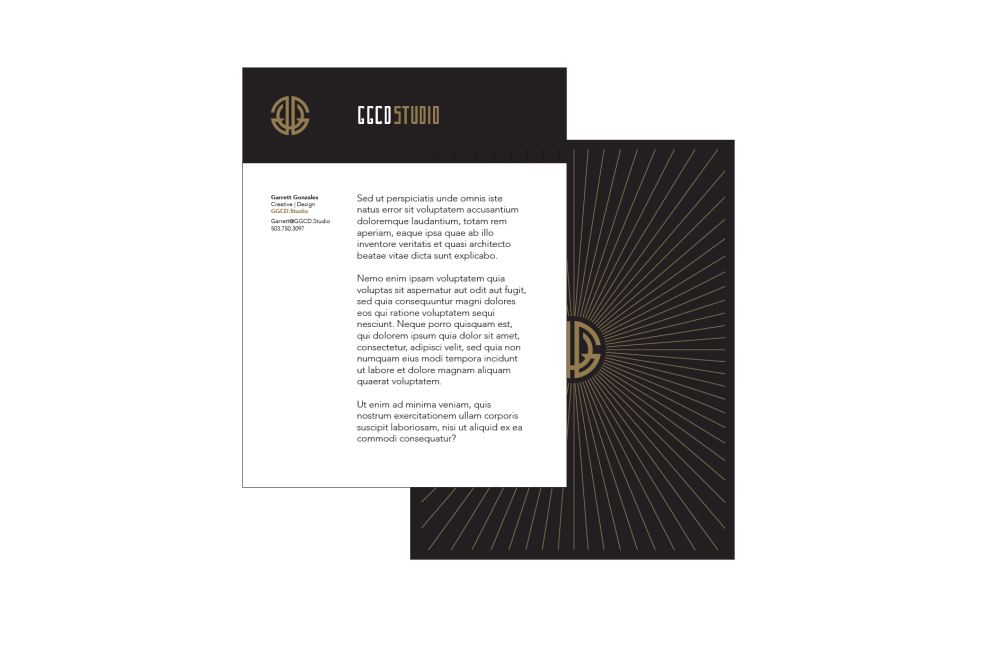

When creating a new identity for the studio, I wanted to find something that was inclusive of our network and in line with the latest design trends. I also wanted it to hold a reflection of my passion for tactile print, yet embrace the flat nature of digital design. Like any identity system, these elements are a reflection of our business. A company with a strong understanding of print that also lives in a digital world. One we’re helping design.
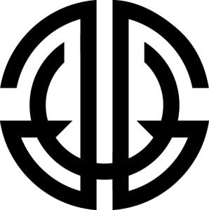
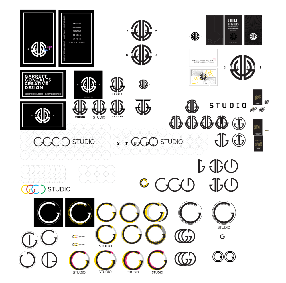
After many iterations, I landed on an art deco monogram. Circles are so much a part of today’s current digital landscape. I also knew from the beginning I wanted a circular mark. Something that would translate down to a favicon. Here are some of the early designs:
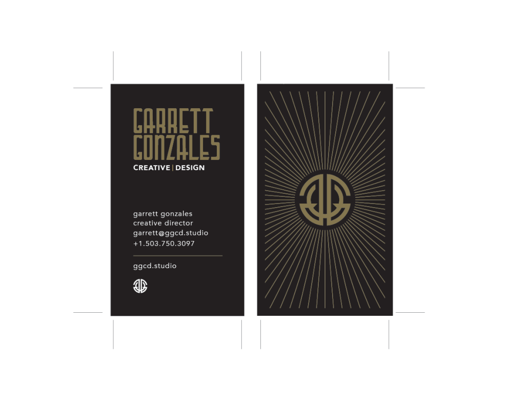
Once the monogram was fairly locked, I searched for a fresh art deco typeface that could work as a display font. Lettering Deco was a great match from its authentic looking period feel, but also had these sharp edges found in the monogram. I paired this with Avenir, a really geometric typeface with great legibility. Lastly, I added some ornamentation to further reflect on the art deco styling. A touch that looks incredible with gold foil stamping on the business cards. I hope you enjoy.